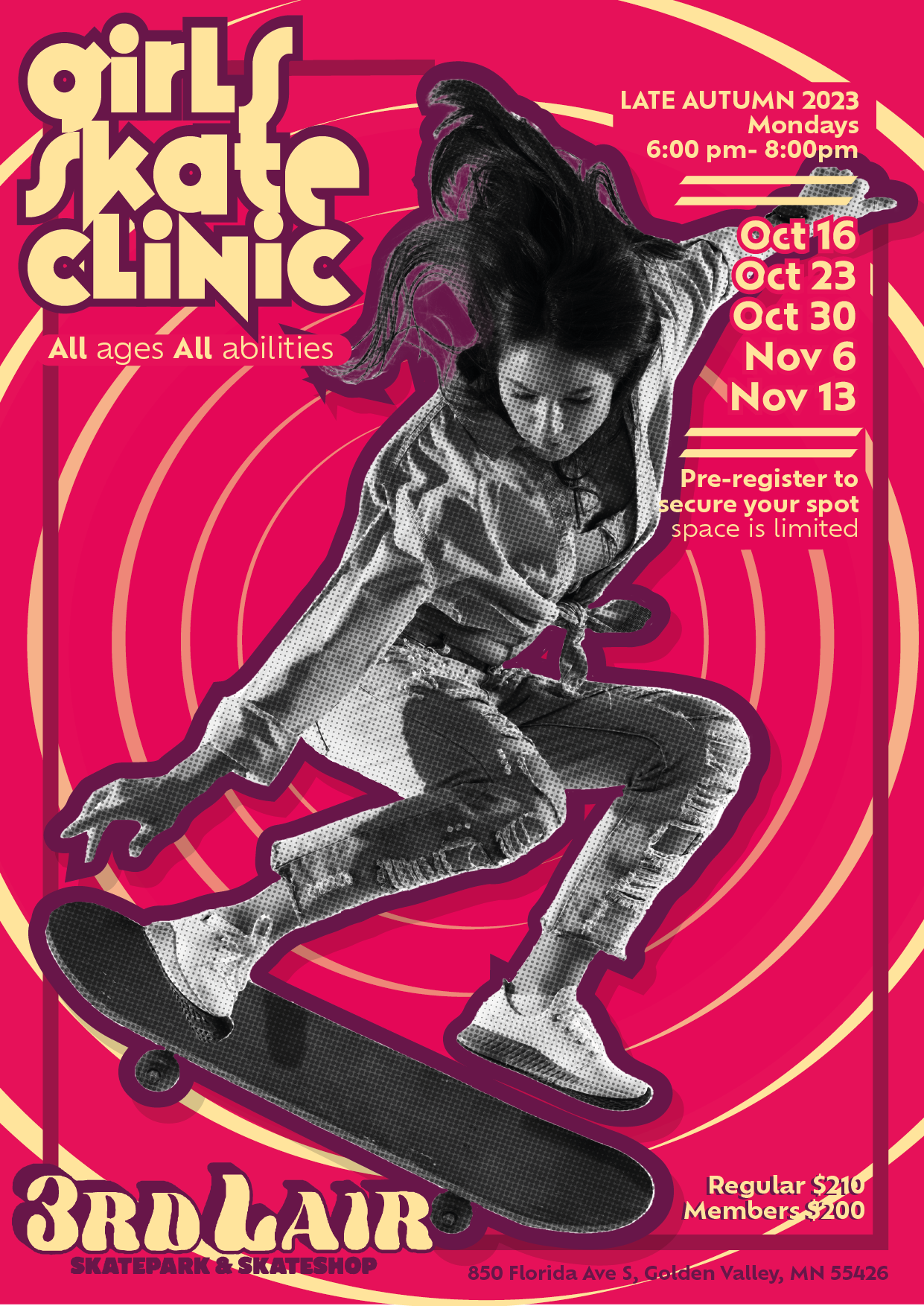
One of the elements that I feel really completes my design is the concentric rings,
inspired partially by Saul Bass' vertigo poster Bass, S. (c.1958) 1. The rings help draw the eye into
the central focal point of the photograph - the skateboarder girl - it creates a more eye-catching
composition if viewed across a room as it demands more focus. I think this poster has the best hierarchy
of information emphasising the most important information to initially show to viewers like “girls skate
clinic” and less emphasis placed on information that needs to be communicated last to the viewer for
example the address.
I chose this work to be my final piece over the other ones because of how well it fits the brand of a
girls skate clinic. I wanted to strike a balance between having a more alternative style that would
appeal to teens and young adults who wanted to get into skateboarding, however along with appealing to
young people I also needed to appeal to customers and make it seem like a reputable establishment worth
spending up to two hundred for the experience. I did this by more clean design choices like highly
legible text, a well ordered hierarchy of information and a simple colour scheme. The elements of my
poster that would appeal to the more fun, alternative nature of teens and young adults. I did this using
bright colours, more angular striking text for the logo and a handcrafted collage feel with the
newsprint texture I overlaid on the photo and the use of a drop shadow.
Across all 4 submitted poster pieces I could have done more in depth exploration of different subjects,
specifically I could have experimented with different photos and illustration work. In addition to this,
I could have implemented some more experimental typography, maybe implementing some of the more
interesting typographic systems like dilatational or radial, rather than aligning most text elements on
a grid system.
1.
(Bass, S. (c.1958) Vertigo [screen printing on paper]. Available from:
https://www.orsonandwelles.co.uk/products/vertigo-1958-us-1-sheet-film-poster-bass [Accessed 12 December
2023].)
FINAL DESIGN


